Kobo Audiobooks Masterlist: A Redesign for Enhanced User Experience
Summary
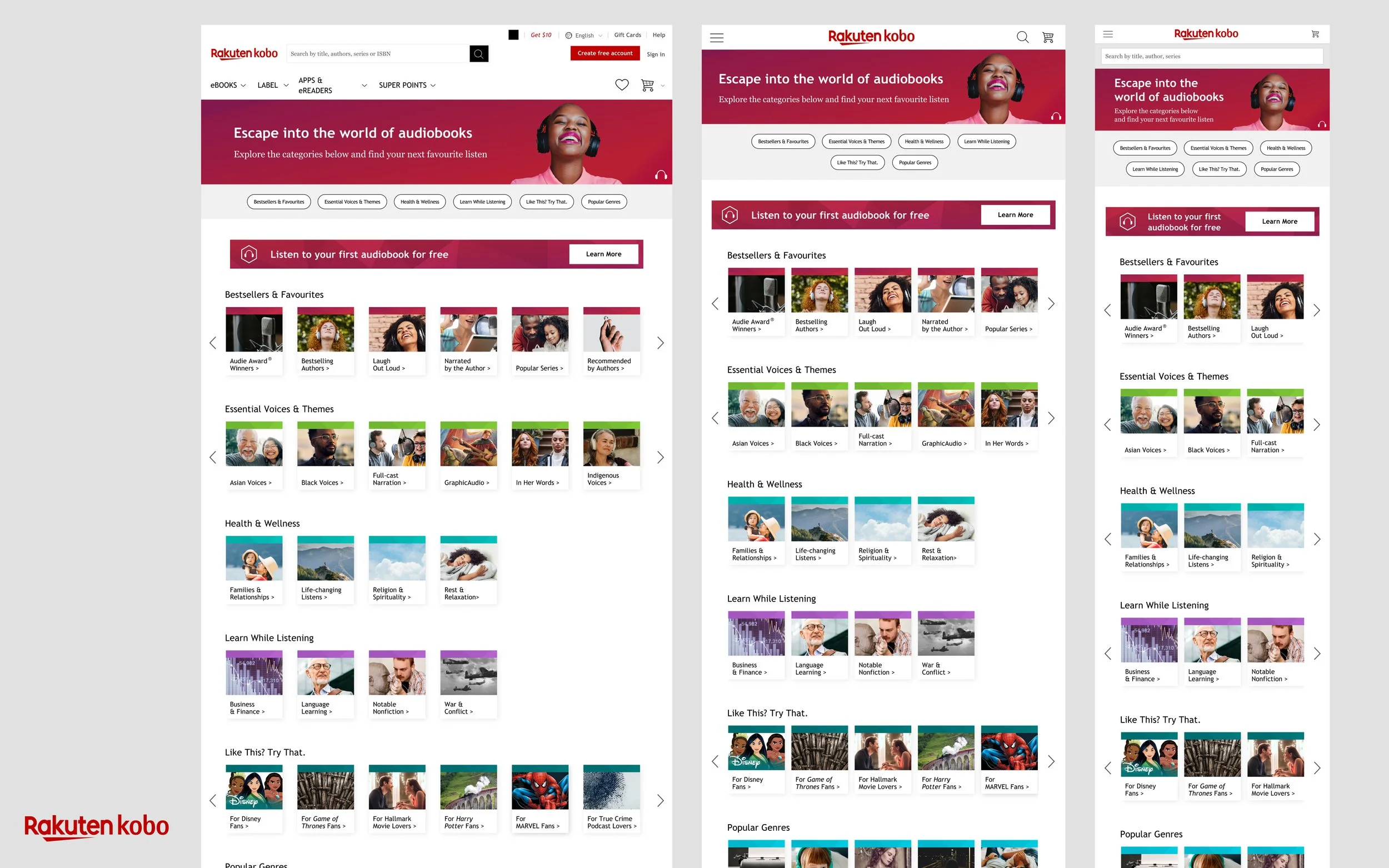
To simplify audiobook discovery for Kobo customers, I led the visual look and feel for the Audiobooks Masterlist. Working closely with the UX team, we utilized user research and usability testing to inform the creative approach. I art directed all page imagery and built efficient internal workflows to ensure this dynamic, high-traffic resource remains easy to update.
Results: Delivered a visually engaging, user-validated discovery hub that streamlined the customer journey and decreased bounce rate by 66%.
Final Design
Problem Statement:
Kobo's Audiobooks Masterlist page, despite being a high-traffic page, was underperforming in terms of user engagement. Analysis revealed that the mobile version of the page was excessively long, with a height of 12,159 pixels, making it difficult for users to navigate. Additionally, the sheer number of lists (53 at the time) overwhelmed users and hindered their ability to find desired content.
Design Goal:
Our primary objective was to redesign the Audiobooks Masterlist page to enhance user engagement and make it easier for users to access and browse through the available lists.
Old web page showing length of page and number of categories on mobile.
Leveraging Data to Drive Design:
To improve Kobo's Audiobooks Masterlist page, we analyzed user data. We found that the mobile version was too long and had too many lists, making it difficult to navigate. 75% of users were dropping off after reaching 1/3rd of the page. Our focus was to ensure we increase engagement and make it more accessible.
To improve the Audiobooks Masterlist, we focused on:
Reducing page length
Shortening headers and moving content above the fold
Organizing categories
Designing for scalability
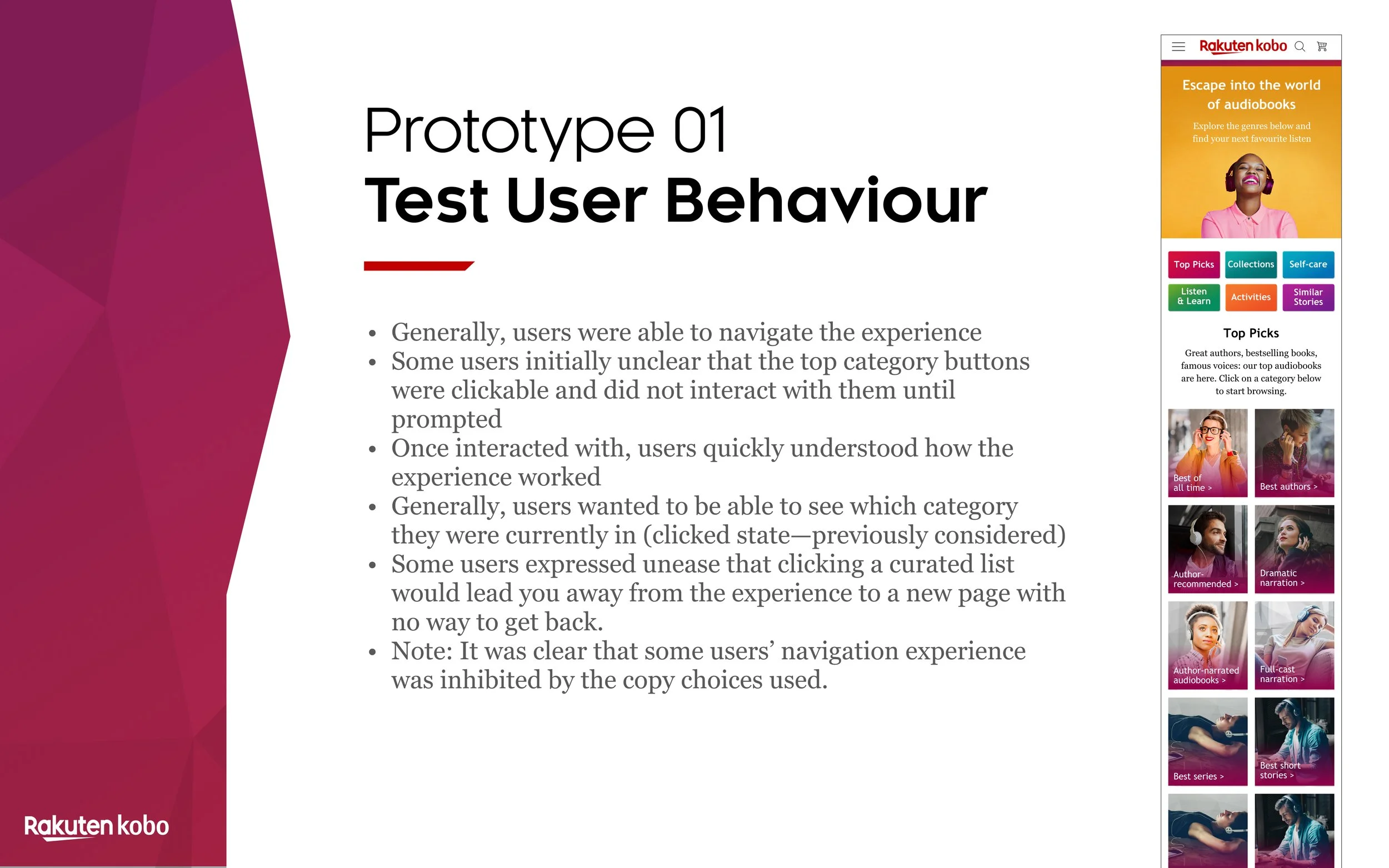
Wireframe for porototype 1
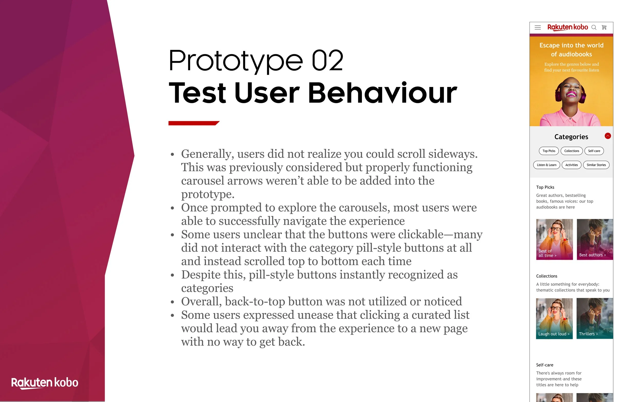
Wireframe for porototype 2
Prototype Development and Testing
To validate our design hypotheses and gather user feedback, we created two interactive prototypes based on the key areas we identified for improvement.
To test the redesigned Audiobooks Masterlist page, we conducted a usability test with 6 participants. We focused on:
Navigation
Task completion
Understanding of content
User feedback
Figma prototypes below showing interactions and layouts used for user testing.
Results
Out of the testing, came a handful of findings:
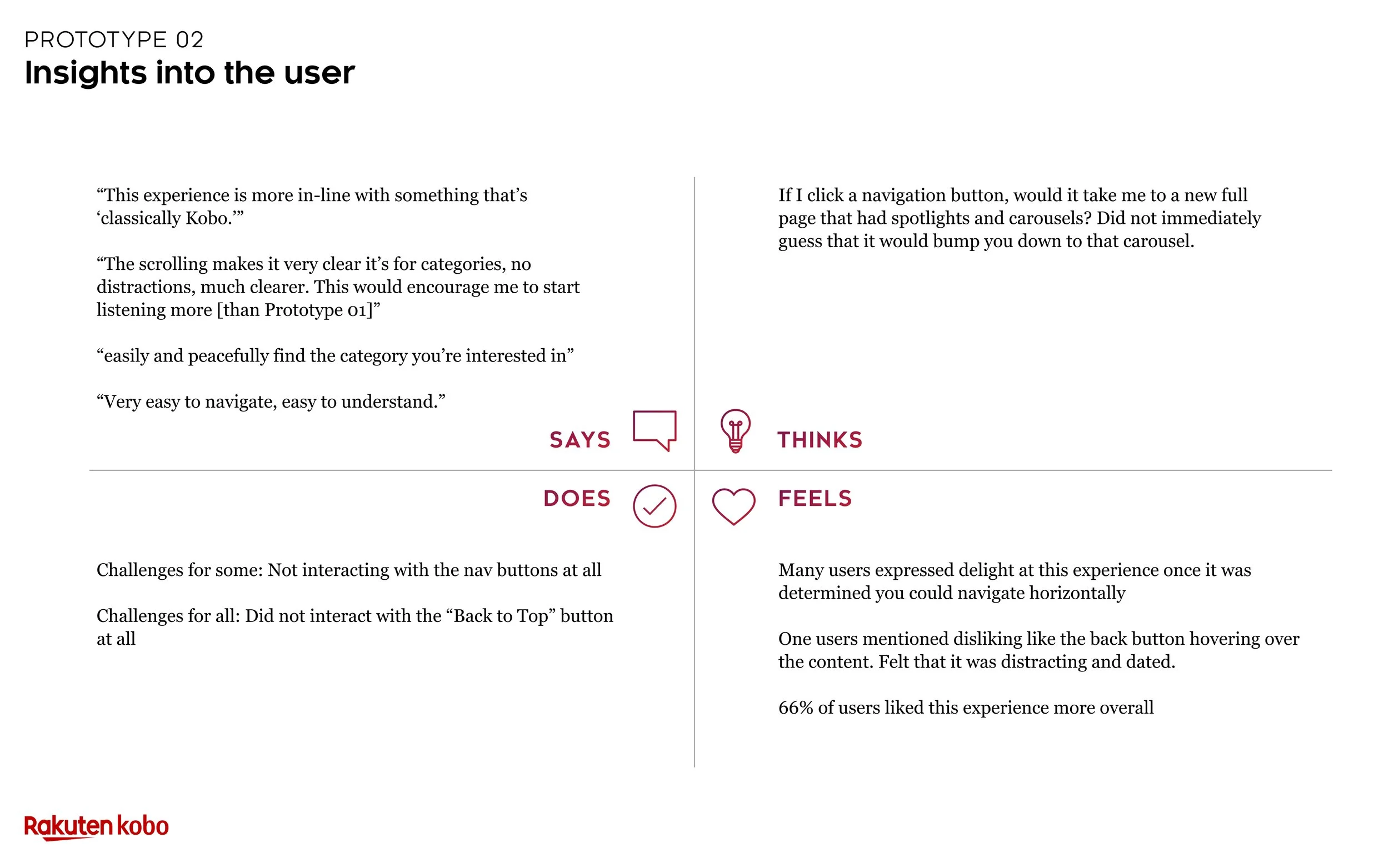
Prototype 2—Preferred navigation (by 66% of participants)
Prototype 2—Overall, back-to-top button was not utilized by test users
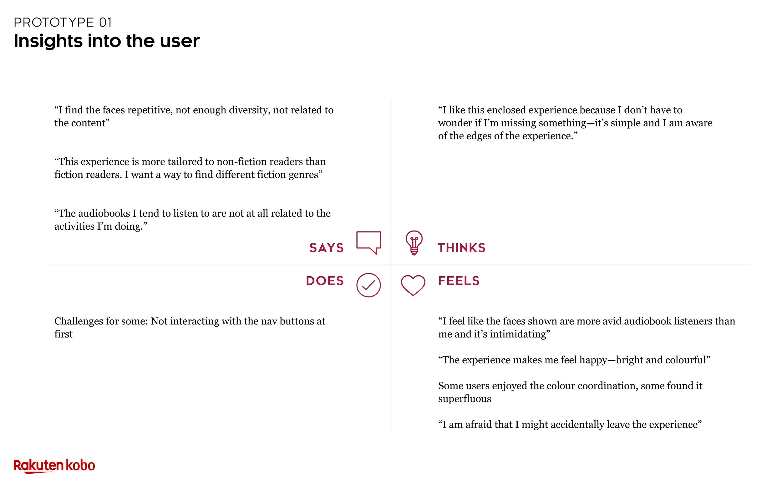
BOTH—“I find the faces repetitive, not enough diversity, not related to the content.”
BOTH—“This experience is more tailored to non-fiction readers than fiction readers. I want a way to find different fiction genres.”
BOTH—“The audiobooks I tend to listen to are not at all related to the activities I’m doing”
Prototype 1—Colourful nature of the page was well-received
Overall Improvements
Based on the insights gained from user testing, we identified three primary areas to focus on for the redesign:
Category Optimization
Navigation Enhancements
Imagery Relevance
By addressing these areas, we sought to create a more engaging and user-friendly Audiobooks Masterlist.
Design improvements
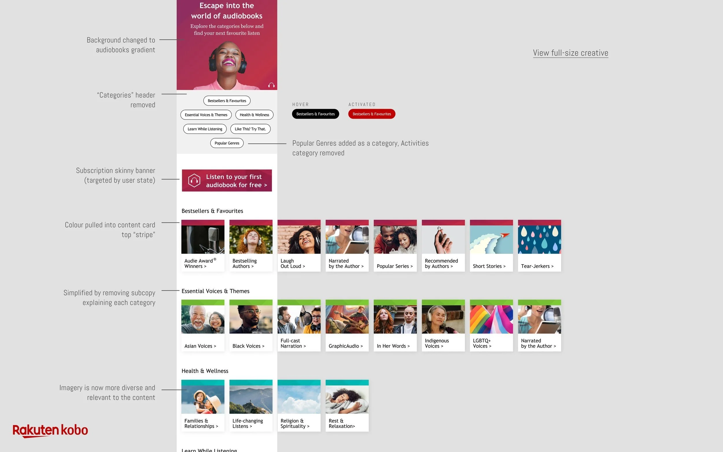
To enhance navigation and overall user experience, we implemented the following design changes:
Horizontal carousel navigation
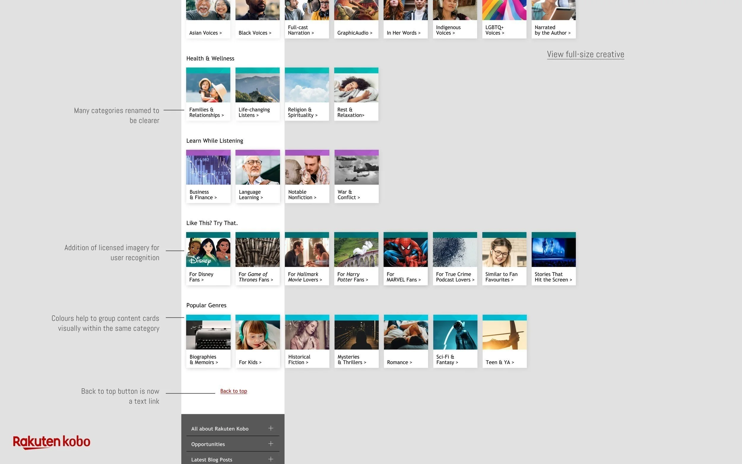
Removal of the Back-to-top button
Use of coloured bars to indicate categories
Thumbnail replacement
Final Product and Impact:
Through a combination of market research, user testing, and iterative design, we successfully addressed the original challenges identified in Kobo's Audiobooks Masterlist.
Key improvements included:
Reduced scroll length
Efficient header
Improved categories
Relevant imagery
Accessibility updates
With the redesigned page now live, we have implemented a new heatmap analysis to track user behavior and measure the impact of our changes. By analyzing these results, we can assess the improvements in usability, conversion rates, and user interaction. This data will inform future iterations and help us further optimize the Audiobooks Masterlist to achieve an ideal user experience.
